UX Design
It is vital for the user experience to provide a readable text in any language supported by a service. When it comes to internationalisation, the font can be an endless source of questions.
Noto is an ambitious open font family from Google with the objective to have no tofu – those little squares shown when the font has to display a missing character –
Here is a video of Monotype, the team who’s still working behind Noto to make it better and better!
But what about a logo? Only a few characters need to be used isn’t it?
A quick and dirty answer would be « Yes », but things aren’t that easy in the real world. Brands need to be identified as much as they need to unconsciously reactivate a brand feeling to the user whenever he is in touch with some content.
![]()
Google uses Product Sans. Myriad Pro is used in Apple’s marketing content. Finally, the French telephone & internet company uses Bienvenue made by Zecraft.
All these fonts are used in both, the logo and the marketing content to drive the user in his reading experience.
Development
Trendy, the glitch effect can be done in full CSS. The trick is to use CSS clip and a keyframe animation.
Claire Larsen shows us how to use a text symbol and the property stroke-dashoffset to animate a SVG.
Photos
Photography in logos inspired by the double exposure technique has been identified by Milo to be a trend in 2017.
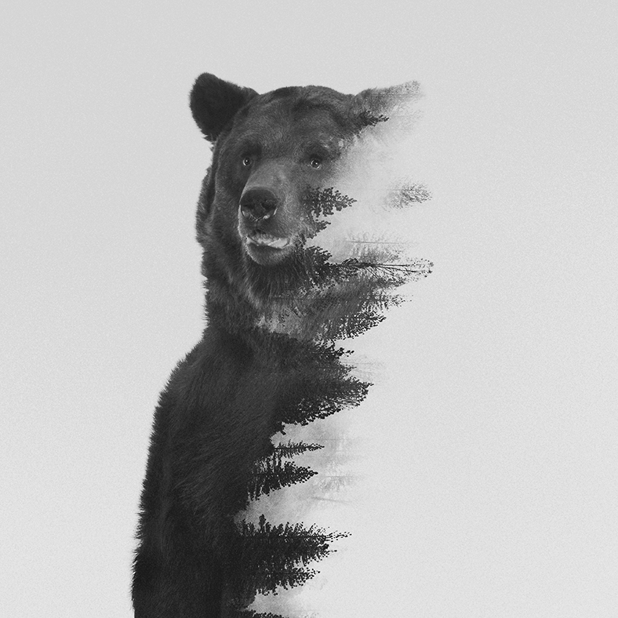 Double exposure by Andrea Lie
Social Media Management / Marketing
A font is not only a type of graphical representation of text anymore, it can actually be fully part of a brand.
Here’s an easy one, do you recognize this one?
¡ʎǝusıp ʎlsnoıʌqo sı ɹǝʍsuɐ ʇɥƃıɹ ǝɥʇ
This font family is nowadays often linked to the company name, to its worldwide identity. A well-studied brand identity provide the instant recognition of a trademark.
The example above proves that the typeface of a brand could be fully part of a logo.
![]()
But unfortunately, we can face typographical aberrations sometimes (or often, depends on the country actually):
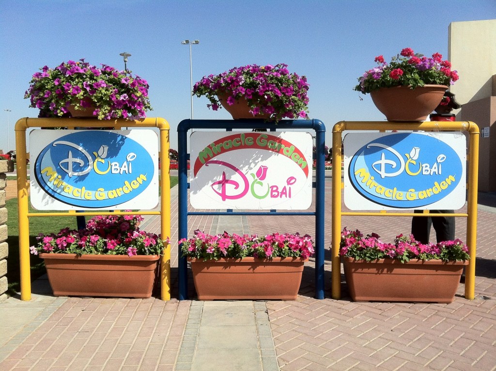
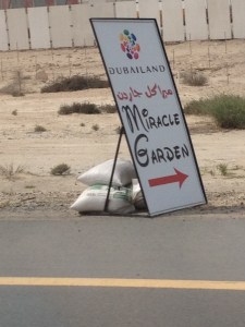
Reading any words bring us to feel an emotion, through the sense of words and then even the font itself! Don’t you feel a little bit of magic about Dubai’s Miracle Garden?
Choosing a font is essential in Marketing because it should be visible, readable and, for the best ones, memorable. In the next example, there is clearly a problem of reading. The important information here is the word « glitter » so it is isolated in the space of the text and also through the color of the font. No problem so far. But, the choice of a cursive script is very tricky, it is smooth and elegant but the clarity of the word is shaded by it too. Moreover, the letters can’t all be at the same type height!

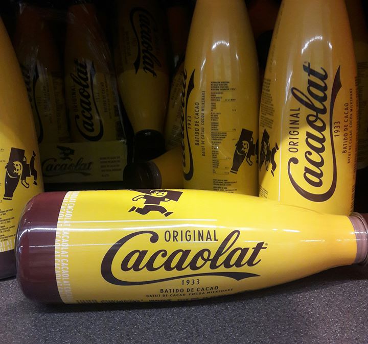
Being able to identify a brand only with colors or typeface is the proof of a powerful marketing campaign. For most of us, we would remember the milk-based drink thanks to the combination of the colors brown and yellow, but don’t you identify Coca-Cola’s font too?
Not sure that you would remember « Cacaolat » without those elements from other trademarks… So no proper identity here.
Digital nomad
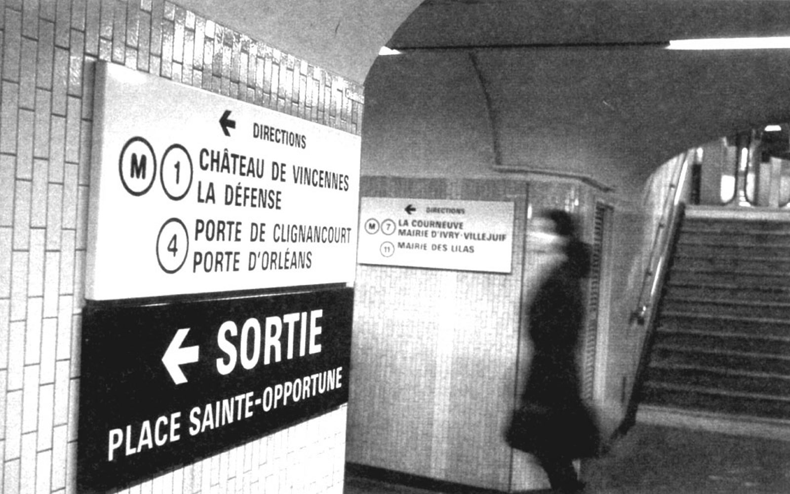
If you ever travel to Paris or London then you’ve met the highly readable typefaces, specially made for their subways.
Parisine typeface
Made by Jean François Porchez
Source : Typefonderie
Johnston 100 typeface
Made by Edward Johnston
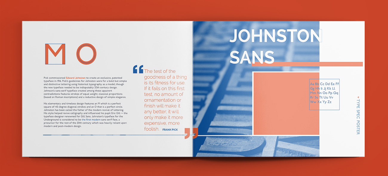
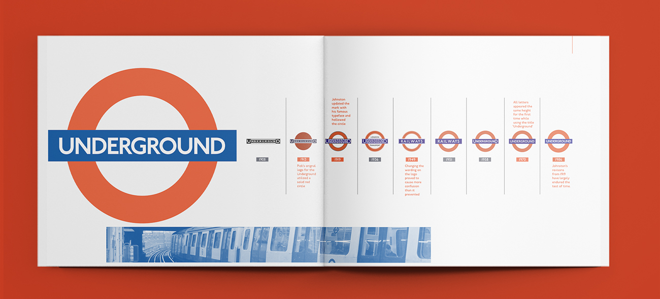
Source : The London Underground: A Graphic Design History
Graphic design
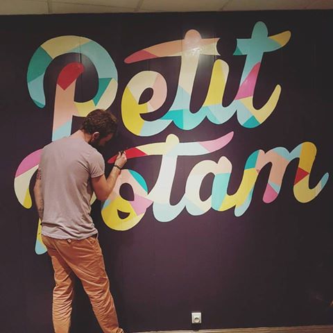
Handmade typeface
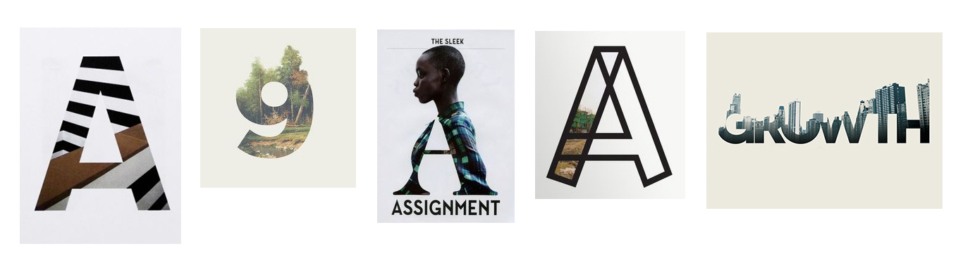
While making a logo, one of the complicated task is to make something fresh and up to date, without getting too much into trend.
To achieve the design of a timeless logo, a logo typo can be a good choice.
a timeless logo example
It can definitively fall into the hipster pit. Looking good for a year but then get outdated and obsolete. These past years, we saw the rise of handmade logo and it quickly became the uninspired default choice.
You can even find a online generator like hipster logo generator to make that kind of stuff.
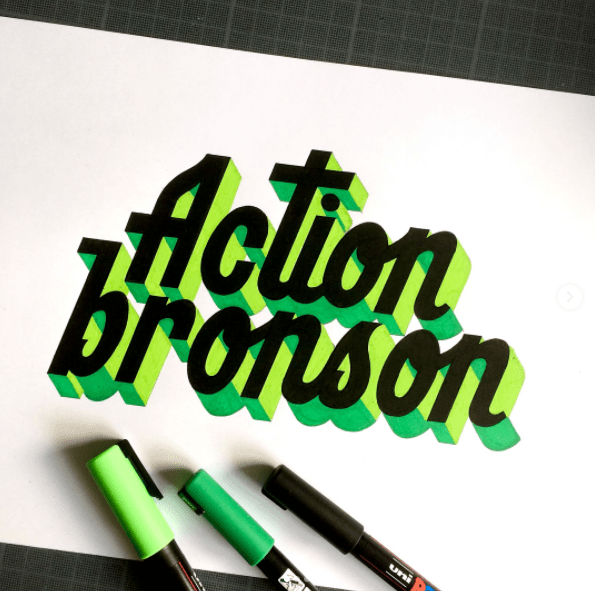
On the other side some artists embraced handmade typo and create some amazing logos and fonts using only pen, ink and paper:
Source : https://www.facebook.com/aireneka
Source : Tarwane on Instagram